COOL TO
CARE
Through redesigning the Cool to Care website, we aim to enhance users’ experience with the brand and increase awareness of the importance of Cool to Care’s initiatives and sustainable fashion in general among the target audience, Gen Z.
TEAM MEMBERS
Matthew Morales, Nicholas Sofer,
Sami Bree Ortega, Emily Skalovsky
TOOLS USED
Figma, Canva, Trello, Otter.AI, Zoom,
Google Drive Suite
OVERVIEW
THE PROBLEM
Cool to Care, a local Austin organization, promotes sustainable fashion through producing slow fashion items and hosting local events, such as clothing swaps and sustainable community events. As the current website only provides basic information about the brand’s initiatives, our goal in redesigning the site is to provide users with a more informative experience and foster a stronger connection between the brand and users.
We interviewed Kaylin, the founder of Cool to Care, to learn more about why she created Cool to Care and her brand’s values, current initiatives, and future goals.
MISSION AND GOALS
Cool to Care’s aims to promote sustainability, both through selling slow fashion, sustainable items, and by actively engaging the community with monthly clothing swaps and events. Success is defined by building brand awareness, selling shop items, and event attendance
WEBSITE CHALLENGES
Cool to Care is currently using Squarespace so the features of the site are limited to the features and templates Squarespace provides. The current website is fairly simple and lacks information about the brand’s mission.
FUTURE GOALS
Kaylin hopes to offer more slow fashion items in her shop and collaborate with other brands and corporations. She is also considering repositioning Cool to Care as a streetwear brand.
USER RESEARCH
We interviewed five Gen-Z users on their personal style, experience with clothing swaps and local events, perceptions of secondhand items, and perceptions of sustainability.
Most users do keep sustainability in mind while making purchases, but it’s not their top priority. Many of the users regularly or exclusively shop at secondhand stores and limit purchasing to only when they need items.
All users prioritized their personal preferences in purchasing clothing, including comfort, style, and uniqueness of items.
Few of the users have participated in clothing swaps but many expressed interest in participating.
Most users use social media tools like Instagram to find information about local events.
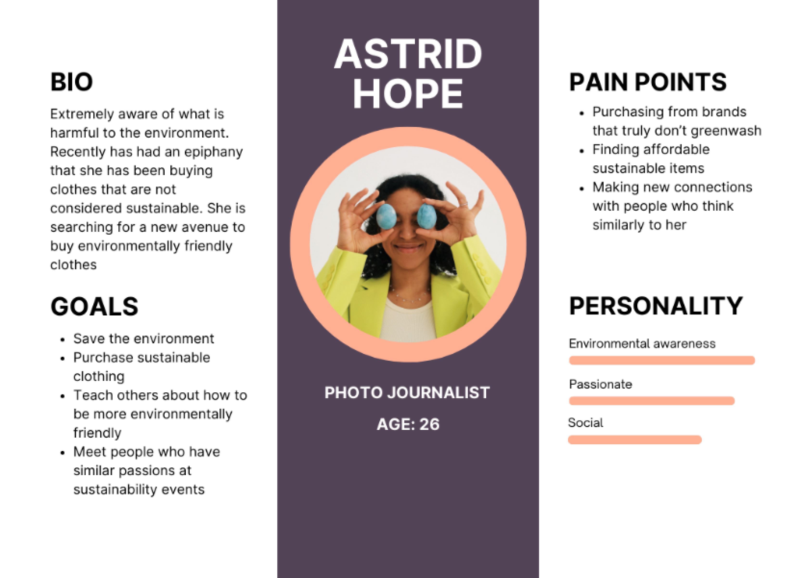
From the information we were able to gather from our interviews a user persona was created that shared many of the common attributes we found.
Astrid Hope became the user that we would ultimately design the site around, using her as a guide to help us make decisions regarding design, userflow, and branding.
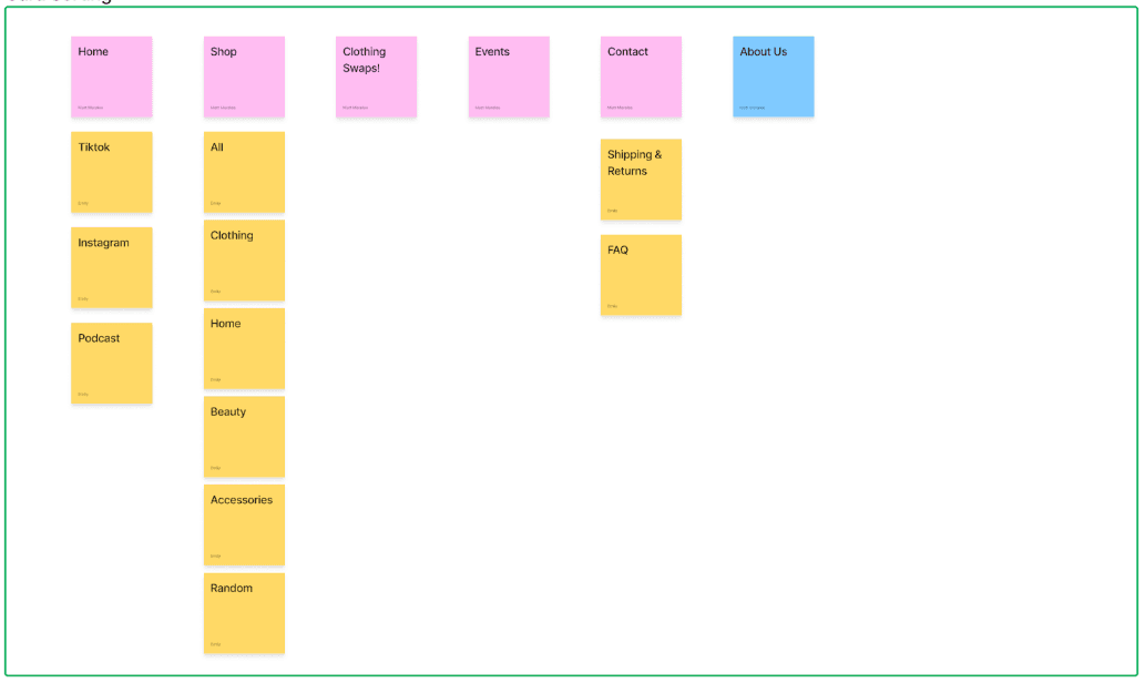
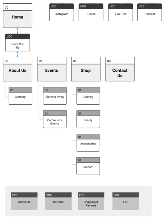
We conducted card sort testing to understand how a user would expect the navigation on the sight to function, having them place different pages in their corresponding categories.
We then used the sorted cards to create a new site map which later would be used to build out the navigation for the site. We believe the new navigation would allow for a more intuitive experience for the user.
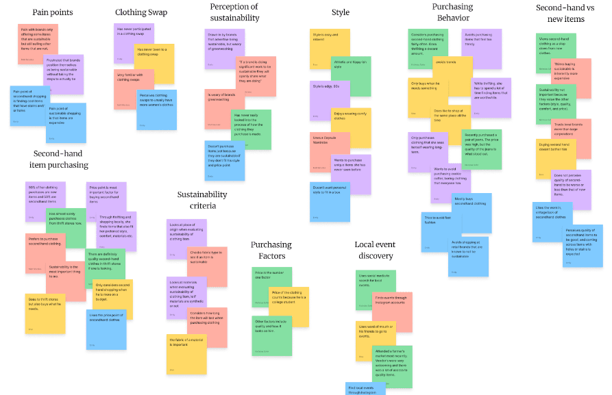
We then broke down the information we received through our user interviews into categories to better empathize with our target demographic.
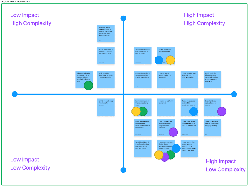
Having categorized all of this information we were able to break down what was most important to future users. The best feature ideas were sorted into a matrix to determine what would have the most substantial impact that could also be realistically implemented.
IDEATION DESIGN
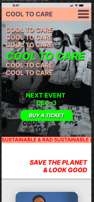
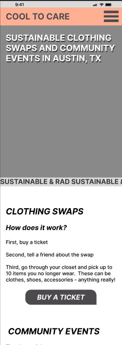
Now that we had an idea of the features we wanted to implement we began the process of wireframing as well as selecting design themes we wanted to incorporate into our design such as bold modern fonts that help indicate to the user that though Cool to Care is a sustainable brand it is still firmly in the streetwear category. We also used a color scheme aimed at attracting a fashion forward, gen z audience.
Much of the design was built around the idea that a key portion of business would be done in person at events and swaps hosted by Cool to Care
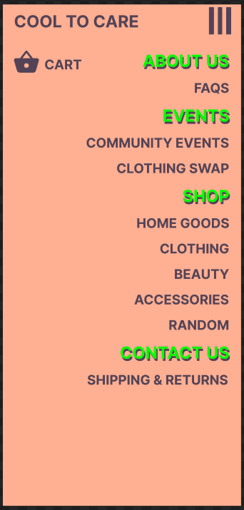
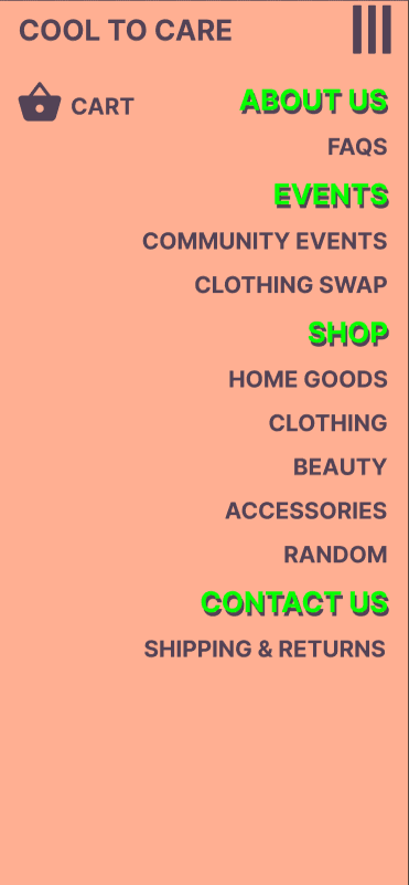
The general navigation was placed into a collapsible menu that uses the new modern color scheme to indicate primary and secondary categories listed in order of importance both to the user and to our stakeholder.
In usability testing of our mid-fi prototype, we gave users three tasks to complete on the mobile and desktop versions, and users completed them with varying success rates.
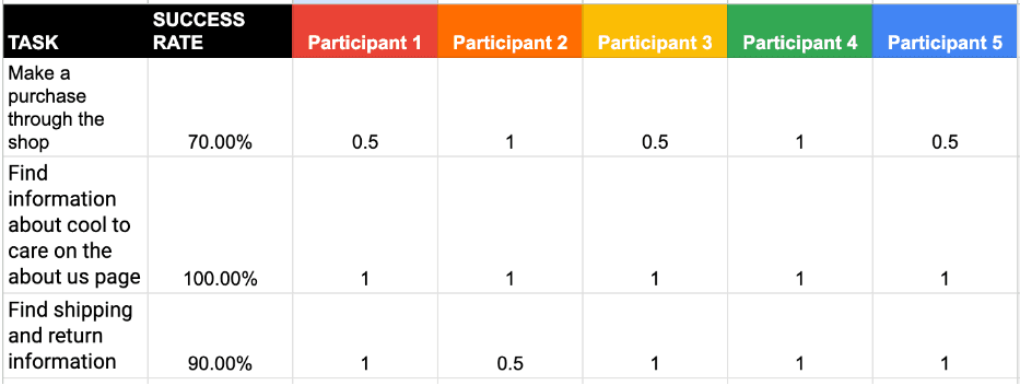
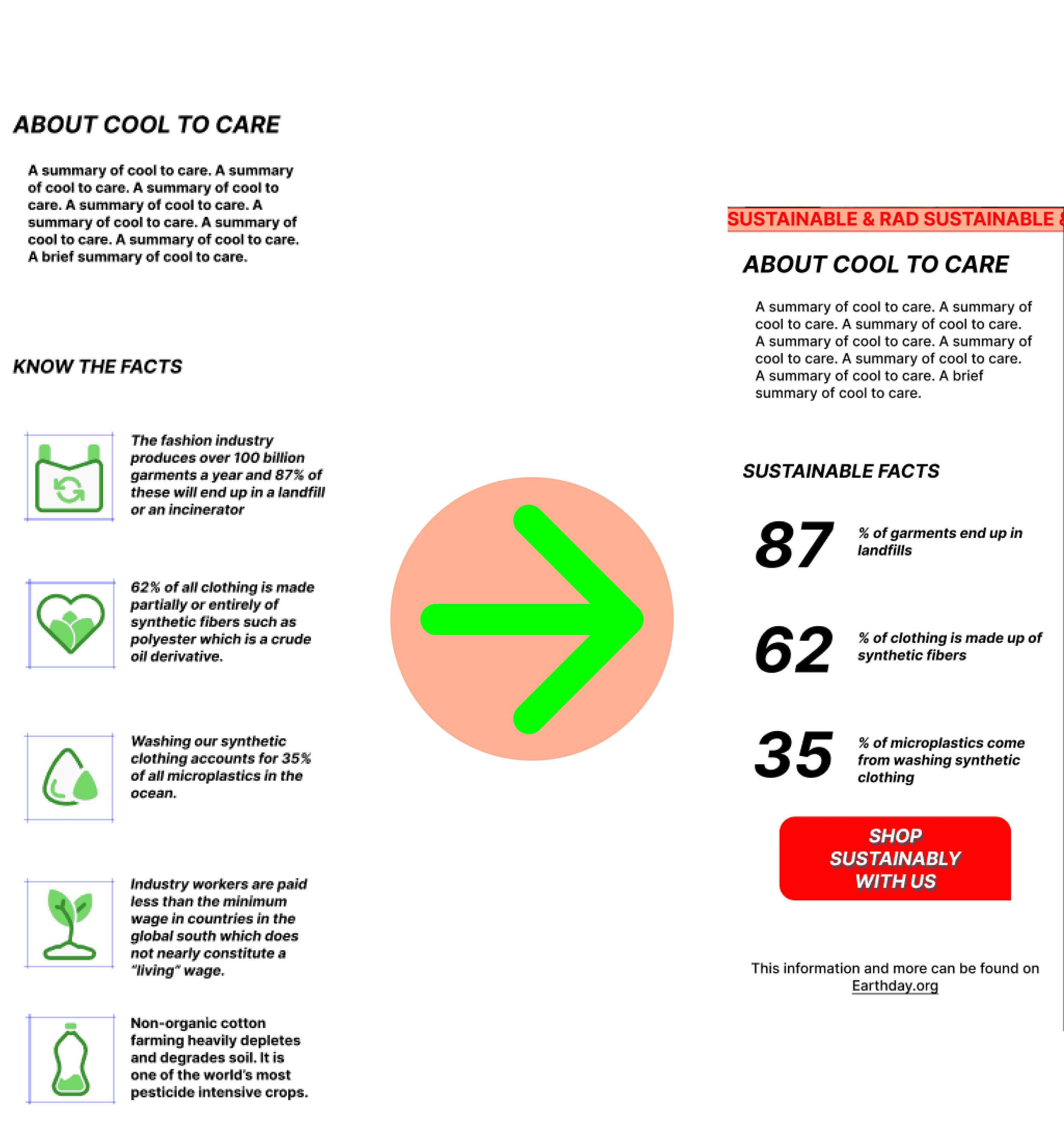
Taking into account the issues users had as well as the positive feedback received in regards to certain features on the site we made a few iterations before a second round of testing that proved to make a significant difference in how well the test users were able to perform the requested tasks.
Iterations:
Updated prototype interaction issues
Adjusted mobile header image size
Updated arrow style for a more modern style
Updated web logo
SUMMARY & CONSLUSION
Our process we believe has proven successful to both our stakeholder and to the end user. We received positive feedback on the new designs both for the updated ease of use and for the new branding and color scheme.
The post-iteration testing determined that our design exceeded the usability of both the original design and the first version we created as a wireframe.