GOLDEN GUIDANCE
Your cozy corner of learning
Team Members: Nicholas Sofer, Matthew Morales, Sami Bree Ortega, Emily Skalovsky
Tools Used: Figma, Trello, Canva, G-Suite, Otter.AI, Zoom
Golden Guidance is a cozy and inviting skill sharing platform inspired by the Danish concept of Hygge, fostering intergenerational connections through older mentors sharing their wisdom and skills with younger users via live and pre-recorded virtual experiences.
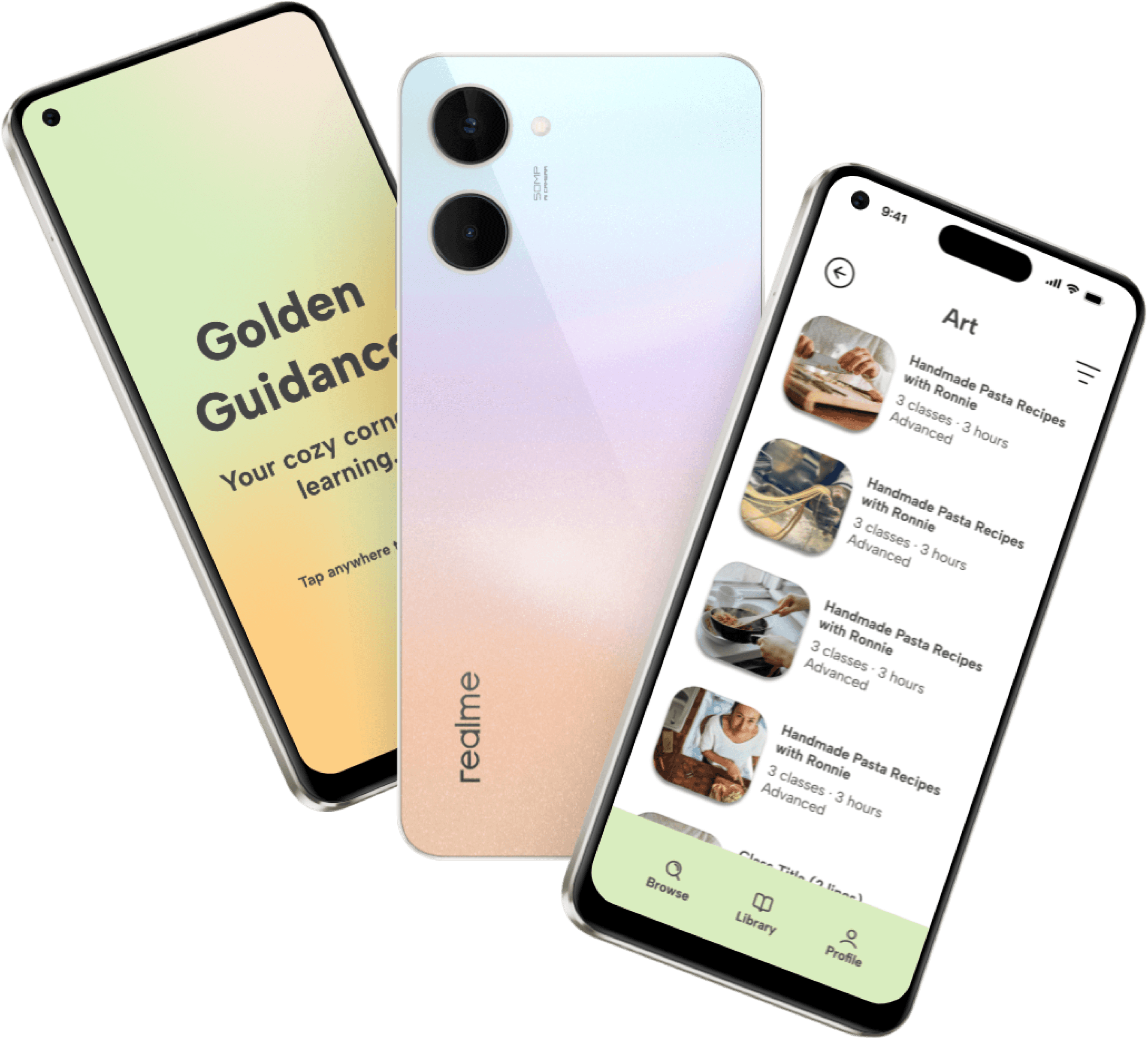
We set out to create an app that will empower older users to share their stories and experiences with younger generations who enjoy virtual experiences. With the success of “Granfluencers” on TikTok like Grandma Droniak, Lili Hayes, and Nonna, more and more young people are enjoying content from older creators. We feel that there are many older users who have skills to share with younger users who enjoy unique experiences.
PROJECT OVERVIEW
The
Problem:
Golden Guidance was designed to be a platform that connects young users with creators of an older generation to learn and share their wisdom and experience. We have observed that our product or service isn’t clearly communicating what can be learned by older generations, which is causing a narrow user base of people not understanding our product. How might we improve Golden Guidance so that our customers are successful based on user retention, traffic, and subscriptions?
The
Solution:
Our solution was to design an app with UI and colors that appeal to younger users while also conveying a sense of wholesomeness. We have also included a variety of categories that mentors can upload videos to outside of the “traditional” hobby categories one would expect to learn from older generations.
RESEARCH PHASE
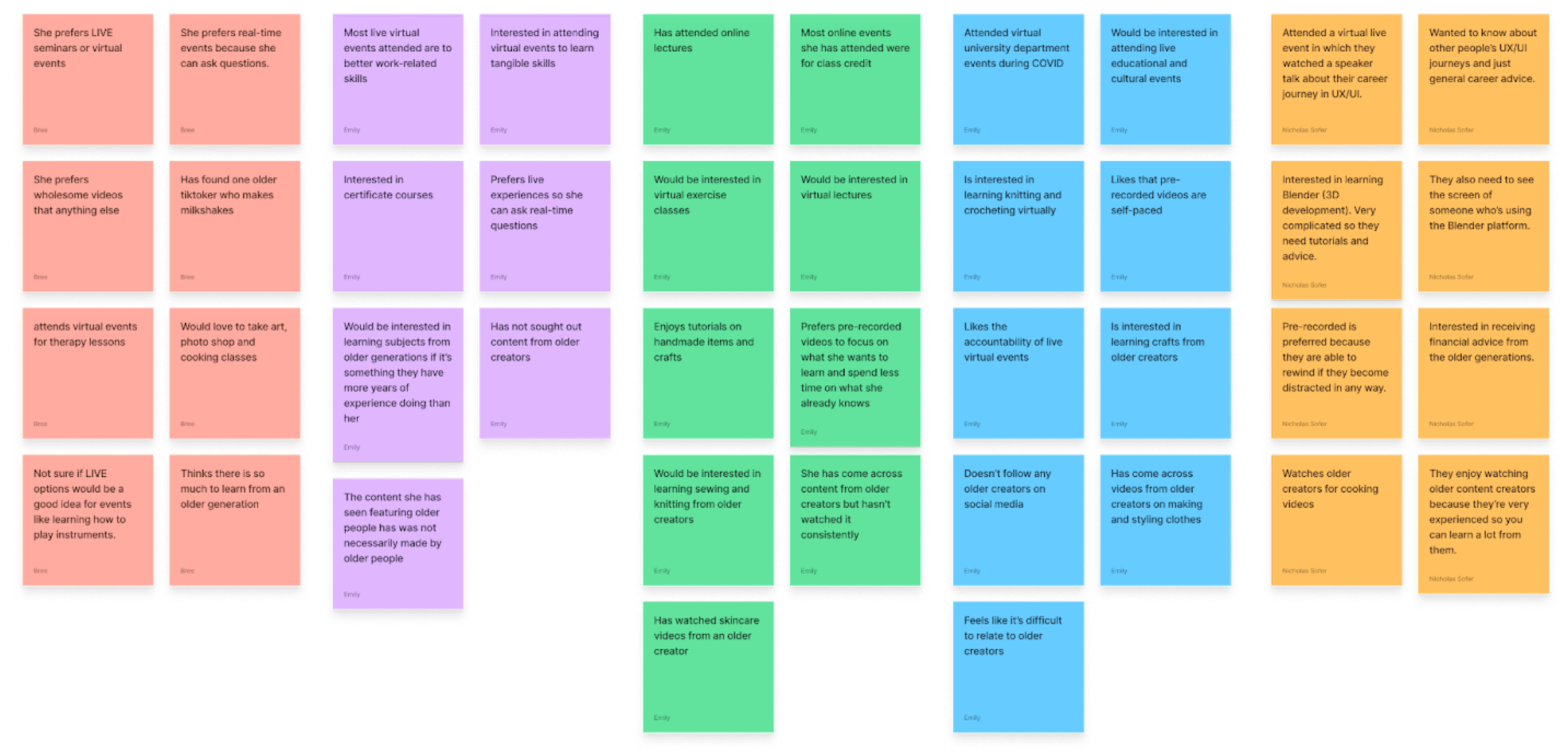
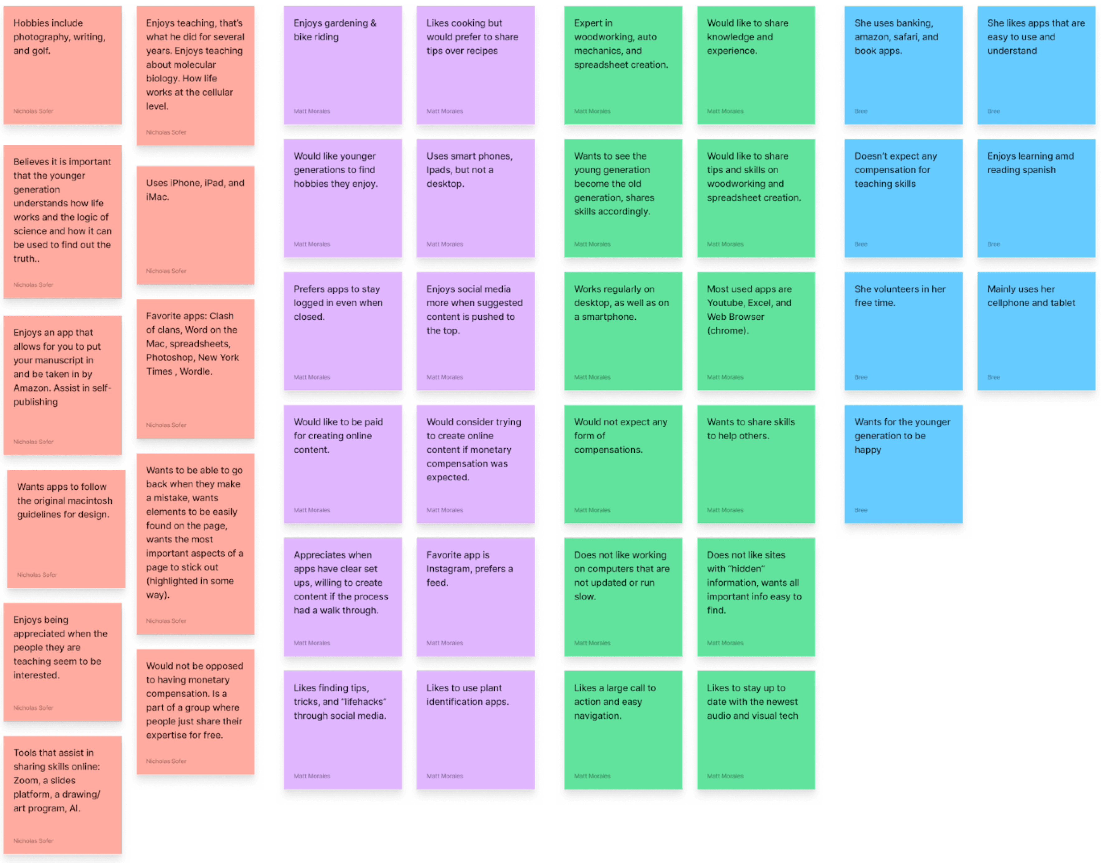
We conducted research by interviewing nine people across two target age groups: five potential students and four potential mentors of the app with two sets of questions to better understand both of our target user groups. For the younger age group, our questions focused on content consumption habits, preferences for virtual experiences, and familiarity with and interest in content created by older users on social media platforms. For older creators, our questions focused on their hobbies and skills, familiarity with using technology, and desired impact on and legacy for younger generations.
During our user interviews, we discovered that younger users largely associate virtual events with online certification courses and lectures where they can learn skills that result in personal development. They expressed difficulty in relating to older individuals, naming "typical" hobbies like knitting and crocheting as potential learning experiences from older generations. Younger users expressed openness to both live and self-paced virtual content, and tend to "take what they need and leave the rest". They value wholesome and relatable content that's relevant to their interests.
Older participants in our interviews shared a genuine desire for the happiness and joy of younger generations. While mostly comfortable with technology, they prefer apps with easy navigation and clear onboarding processes. Some older interviewees expressed interest in receiving compensation for sharing their knowledge and skills, while others would be happy to share their knowledge without compensation.
Competitors include online course apps and websites like MasterClass, Domestika, and Skillshare. These products offer paid courses covering various topics and skills ranging from certificate courses to learning embroidery. We also looked at the Youtube channel and website Pasta Grannies, which features weekly videos of Italian grandmas making handmade pasta.
USER PERSONAS
While we set out on a mission to create an in app experience that would be beloved by both mentors and learners alike, we came away from the research portion of the process with a new perspective. We had a clear vision of what would be expected by both those looking to learn and those looking to teach. After synthesizing the information we gathered, we were able to create User Personas for both demographics that we would use throughout the design stage as representations of the user.
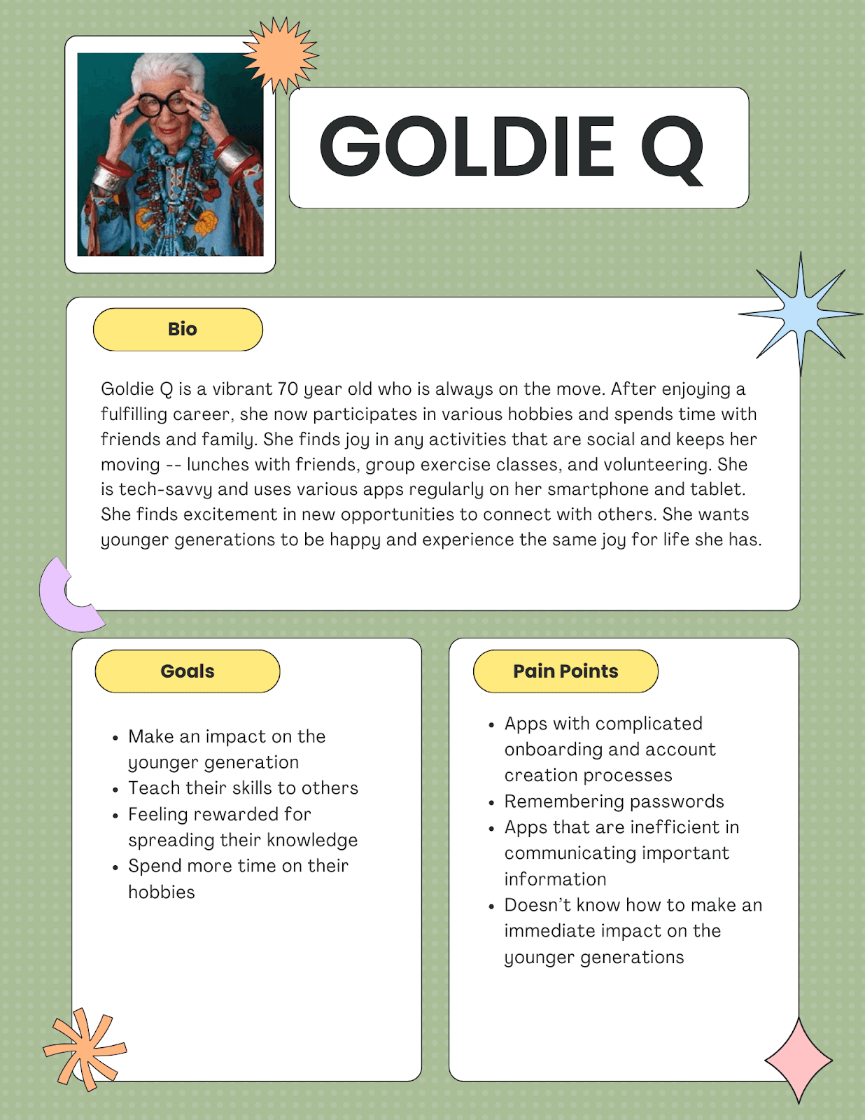
Our first User Persona would be of a mentor, representing a member of either the Baby Boomer or the Golden Generation (duly named Goldie). She is an amalgamation of the data and research we collected and therefore would serve as a more accurate depiction of our users than we would be able to create on assumption alone.
Our second User Persona would be of a learner, not necessarily representing any particular generation (learners come in all shapes, sizes, and ages). Though to accurately represent the sample group we interviewed, Ginny Z would stand in for Gen Z and Millennial users who we found to be interested in learning new skills.
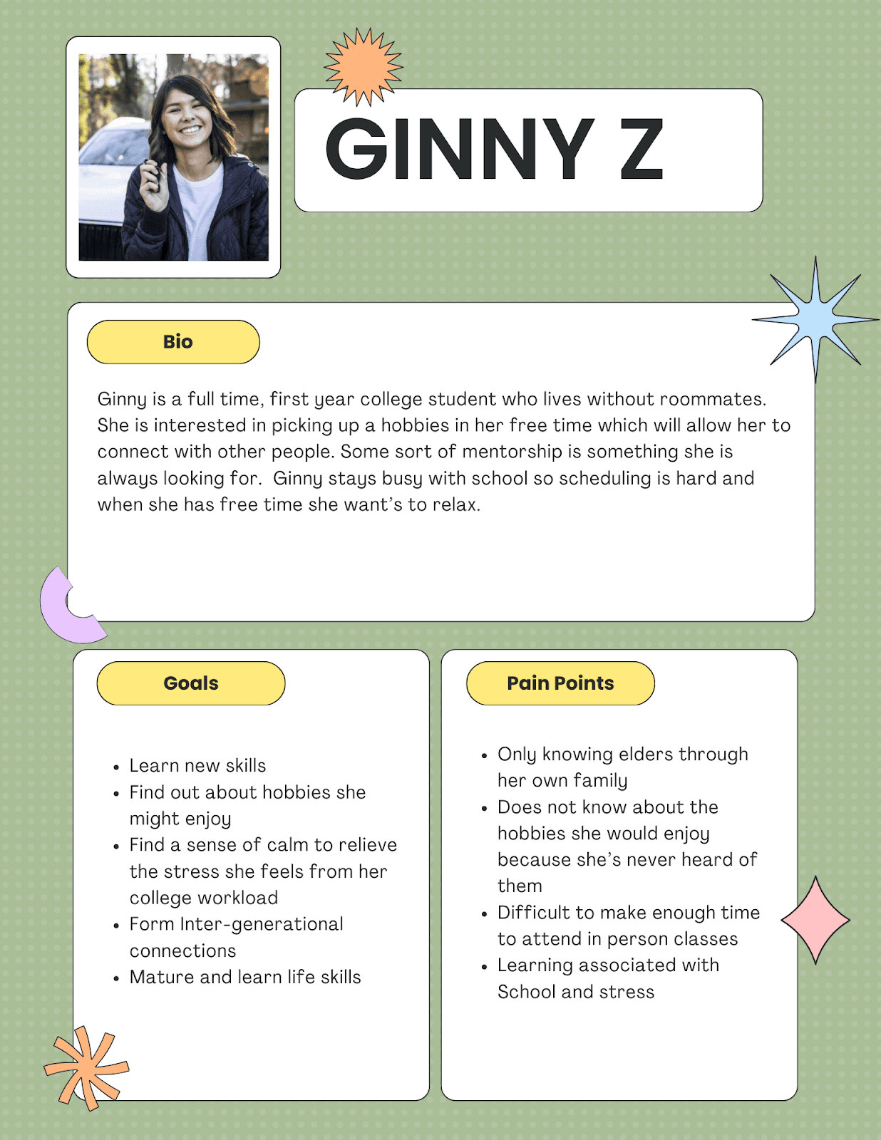
Goldie and Ginny would remain part of our design process through the end of the project. They will both serve as the model users for which we’re designing this experience.
FEATURE PRIORITIZATION
Taking in account what we found through our research and considering what might be best for our User Personas, the team began brainstorming. We each contributed ideas, with the pretense that at this point in the process no idea was too farfetched. We then took these ideas and sorted them into three categories: I want, I wish, and what if.
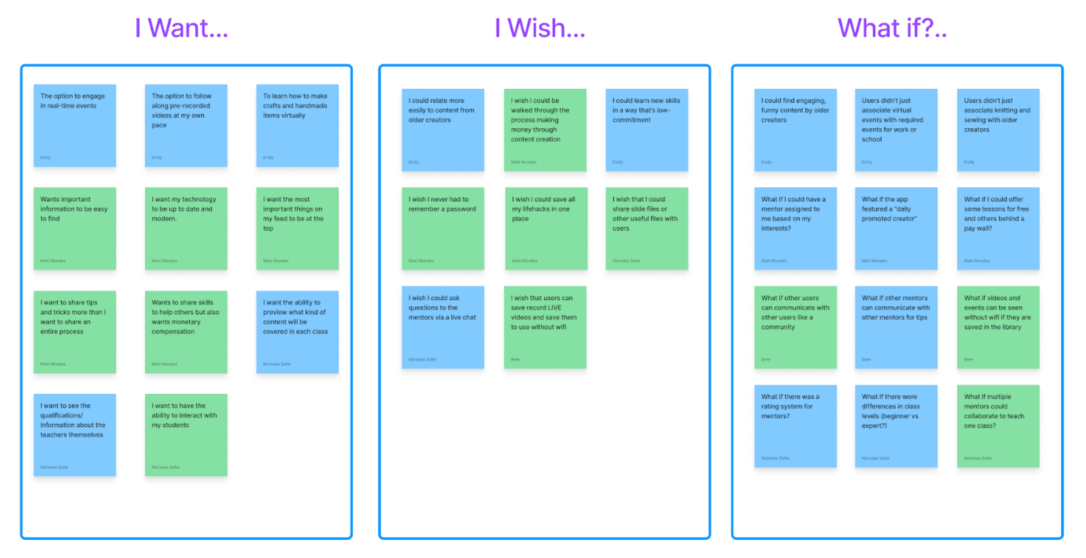
Our ideas had then been categorized, but more importantly, documented. Equipped with a list of potential features that we would like to implement, we began sorting our ideas into a Feature Prioritization Matrix. This method allowed us to find easy wins by honing in on features that would have the greatest impact without putting additional pressure that would possibly cause us to forego other important features later in the process.
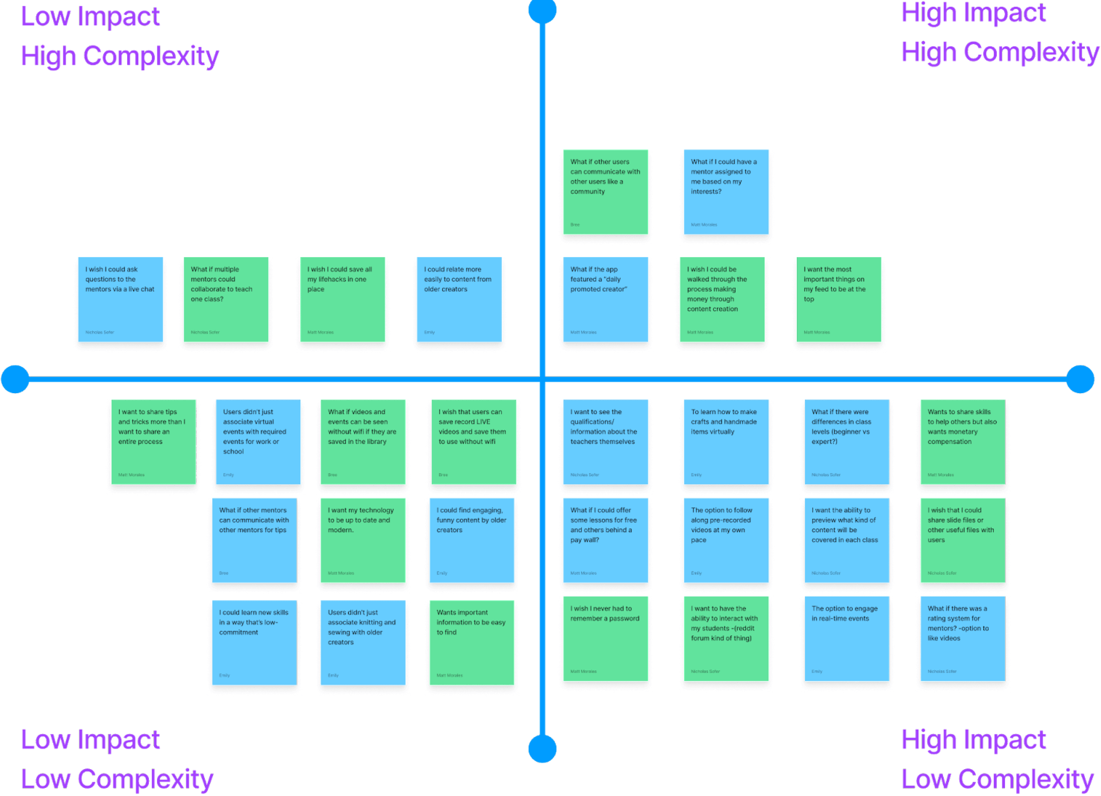
Using this method we were able to find the features that needed to be prioritized. We also came away with a list of features that we could add on that would be high impact but would likely be more time or work intensive.
USERFLOWS & STORY BOARD
In the next portion of the design process we visualized how a user would find value in the app. We drew up a storyboard that walked through a potential user experience.
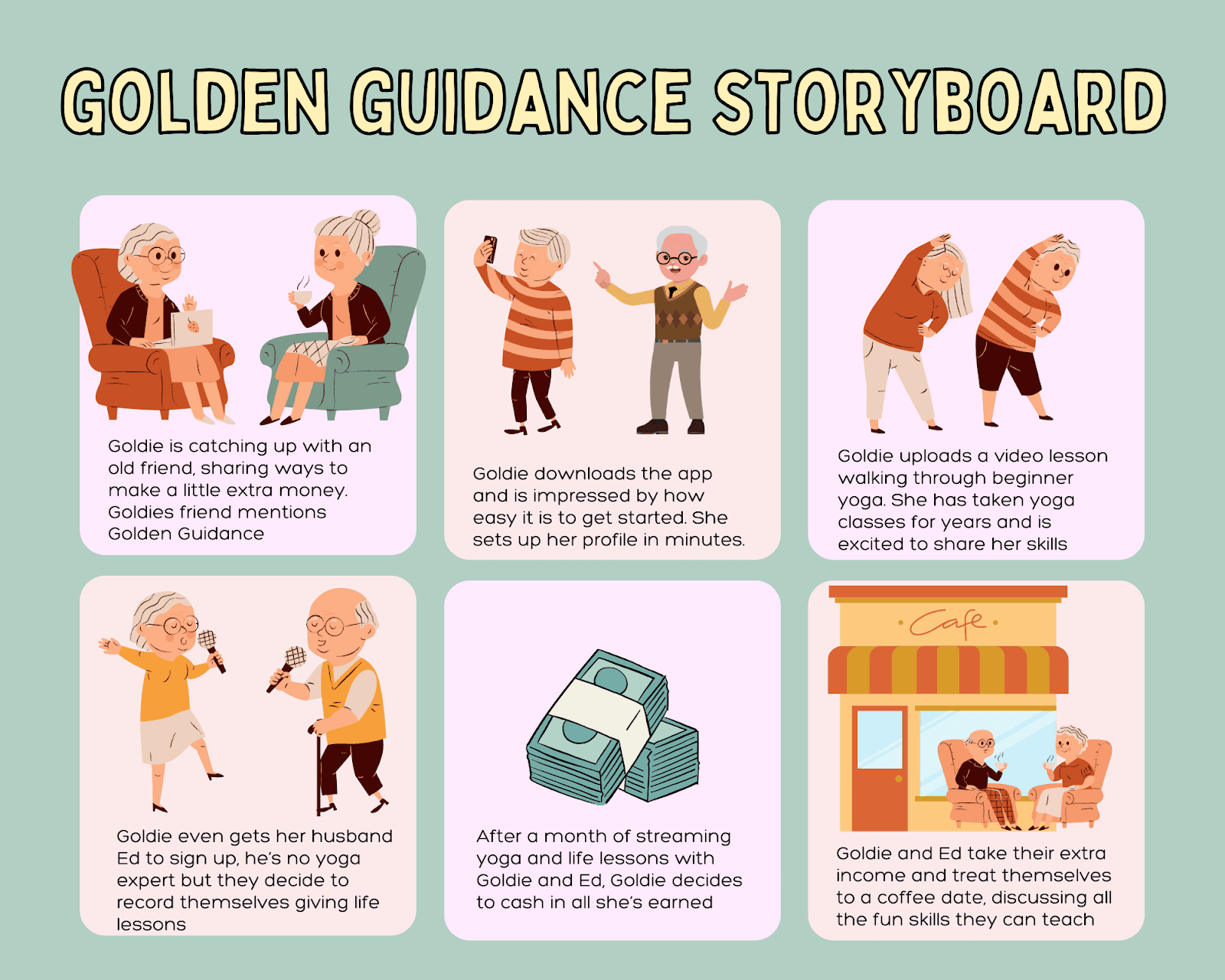
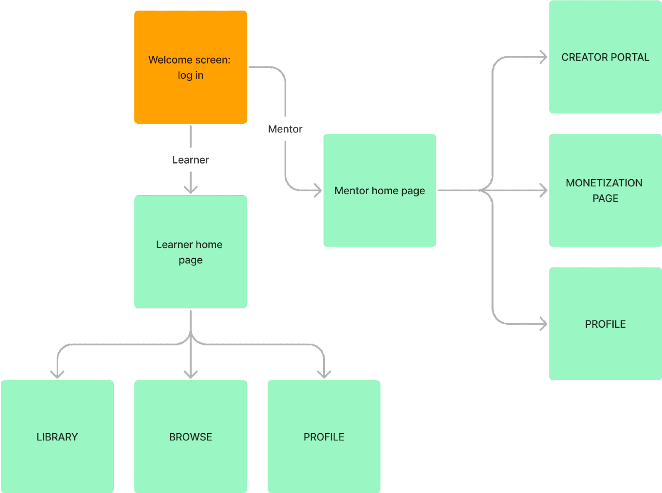
Knowing what features we wanted to incorporate, and how we believed users would expect this app to be structured, we created User Flows that mapped the user experience through initial onboarding and landing.
Sign up Flow
New Accounts:

Login Flow
Existing Accounts:
SKETCHES & WIREFRAMES
Our app would require two flows for our two target users: mentors and students. We first focused on sketching main screens from both flows.
Initial
Sketches:
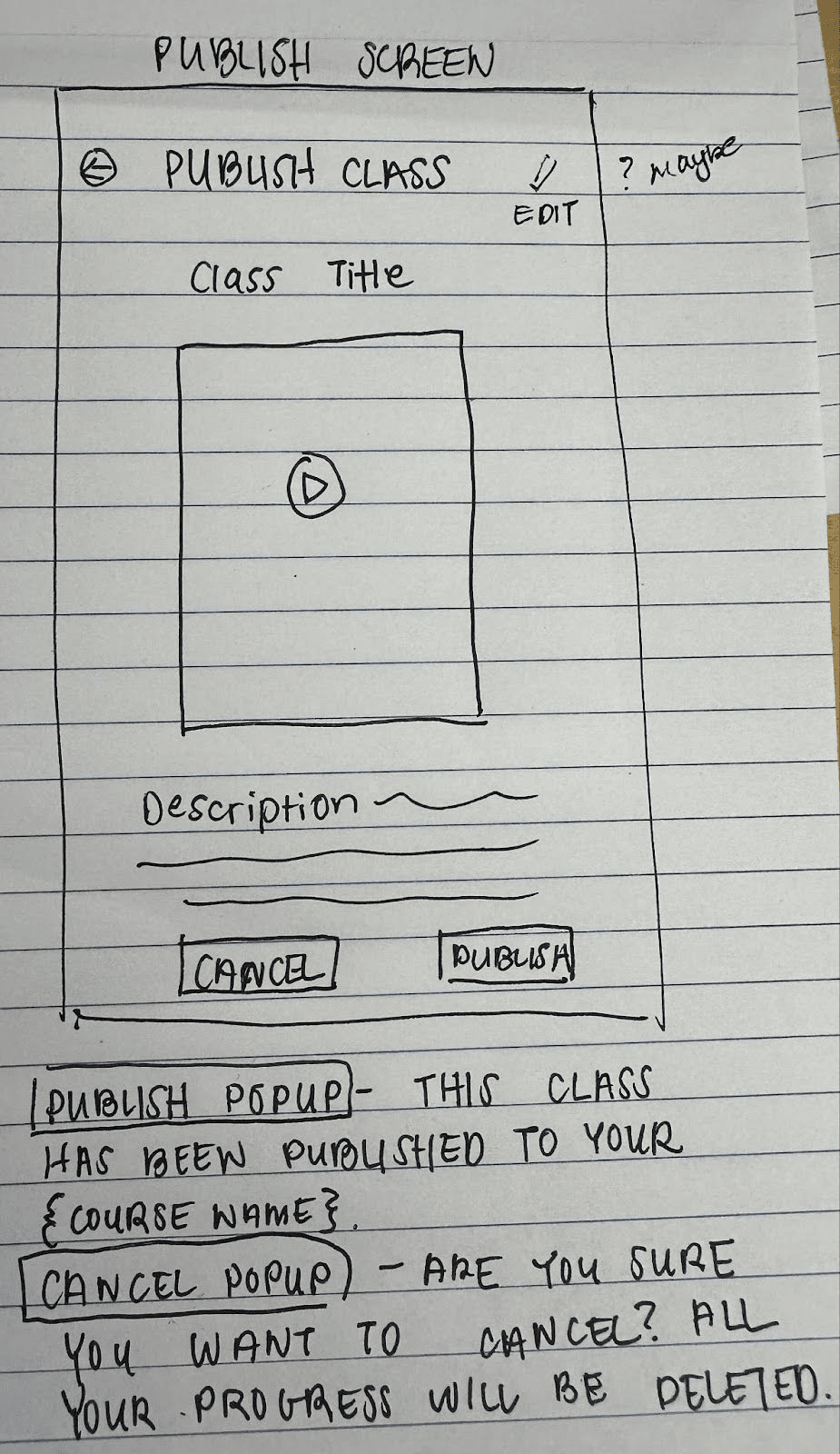
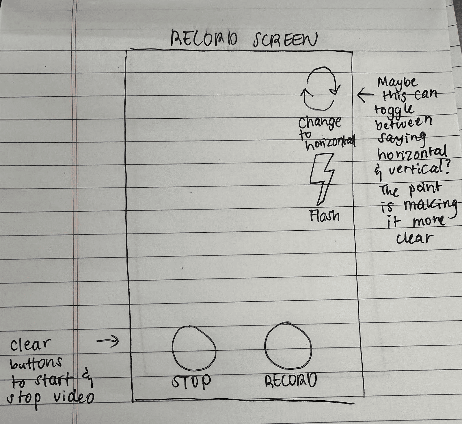
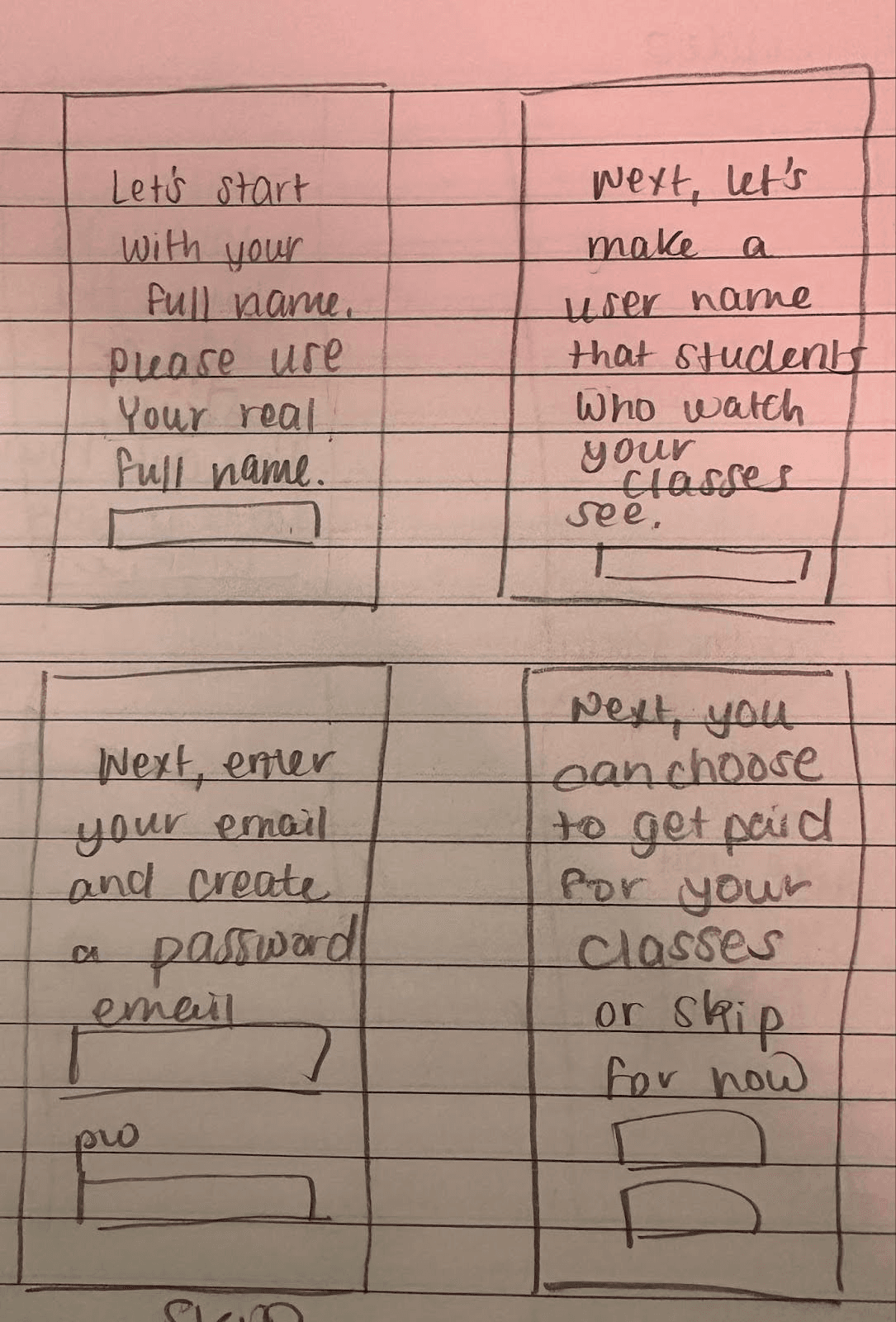
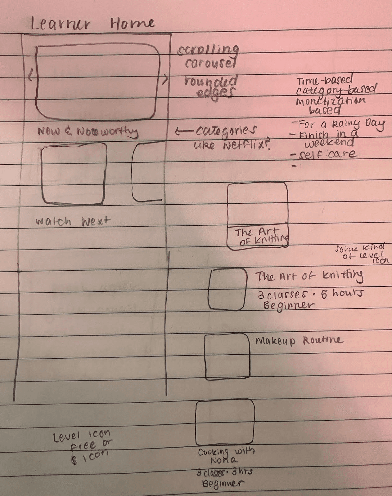
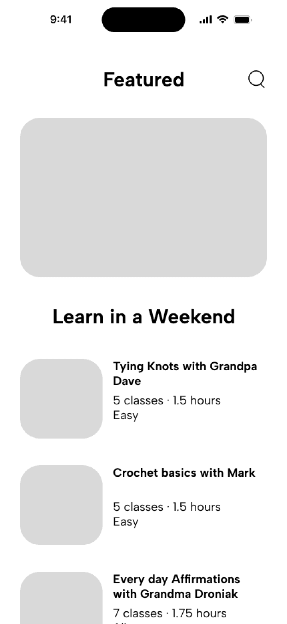
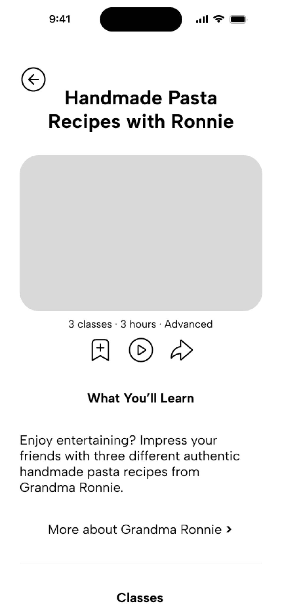
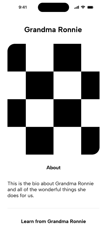
Using our sketches as inspiration, we built out wireframes for both the learner-side and mentor-side of the app.
Learner Flow
Main Screens:
Featured Courses
Page
Example Course
Page
Example Mentor
Profile
Example Class
Page
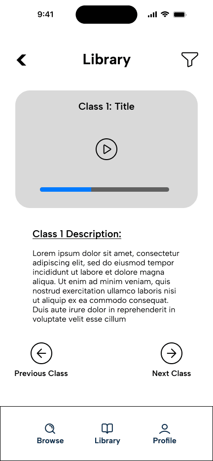
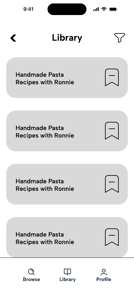
Class Library
Page
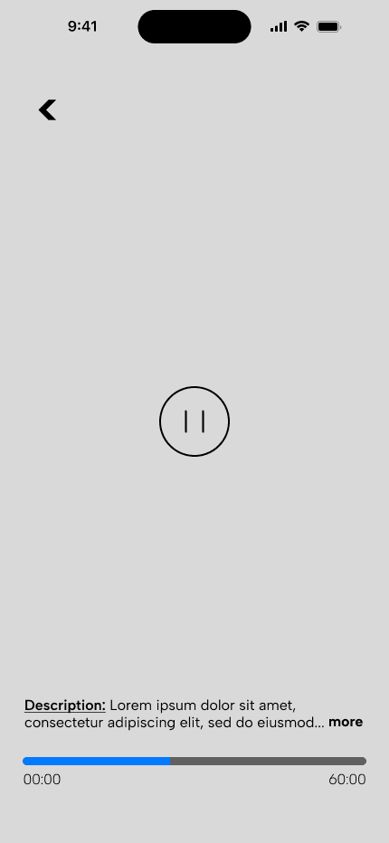
Playback Interface
Example
Mentor Flow
Main Screens:
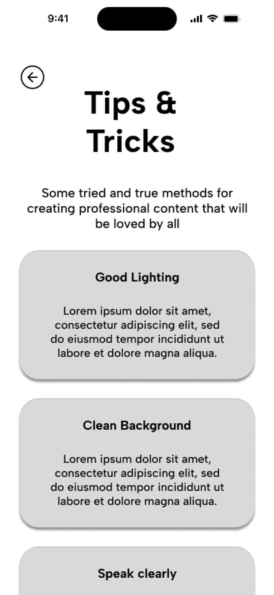
Tips & Tricks
for Mentors
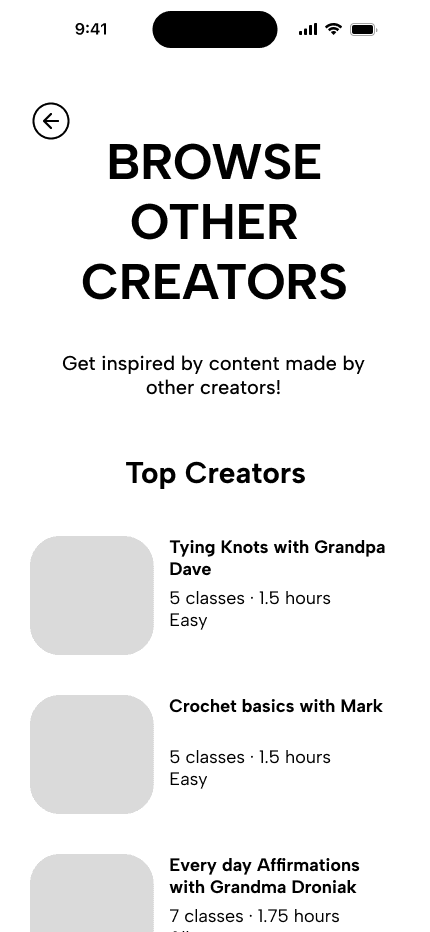
Browse Other
Creators
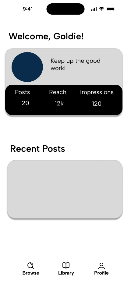
Mentor Profile
Example
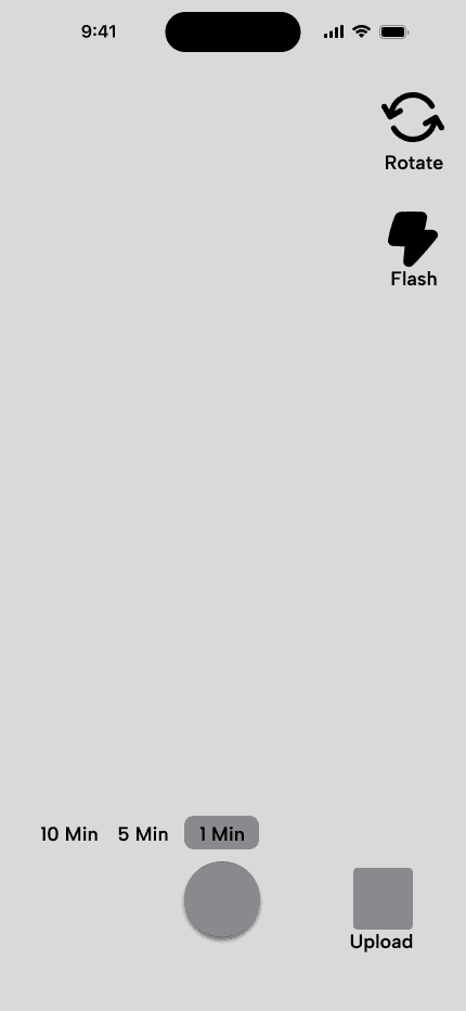
Camera Interface
Example
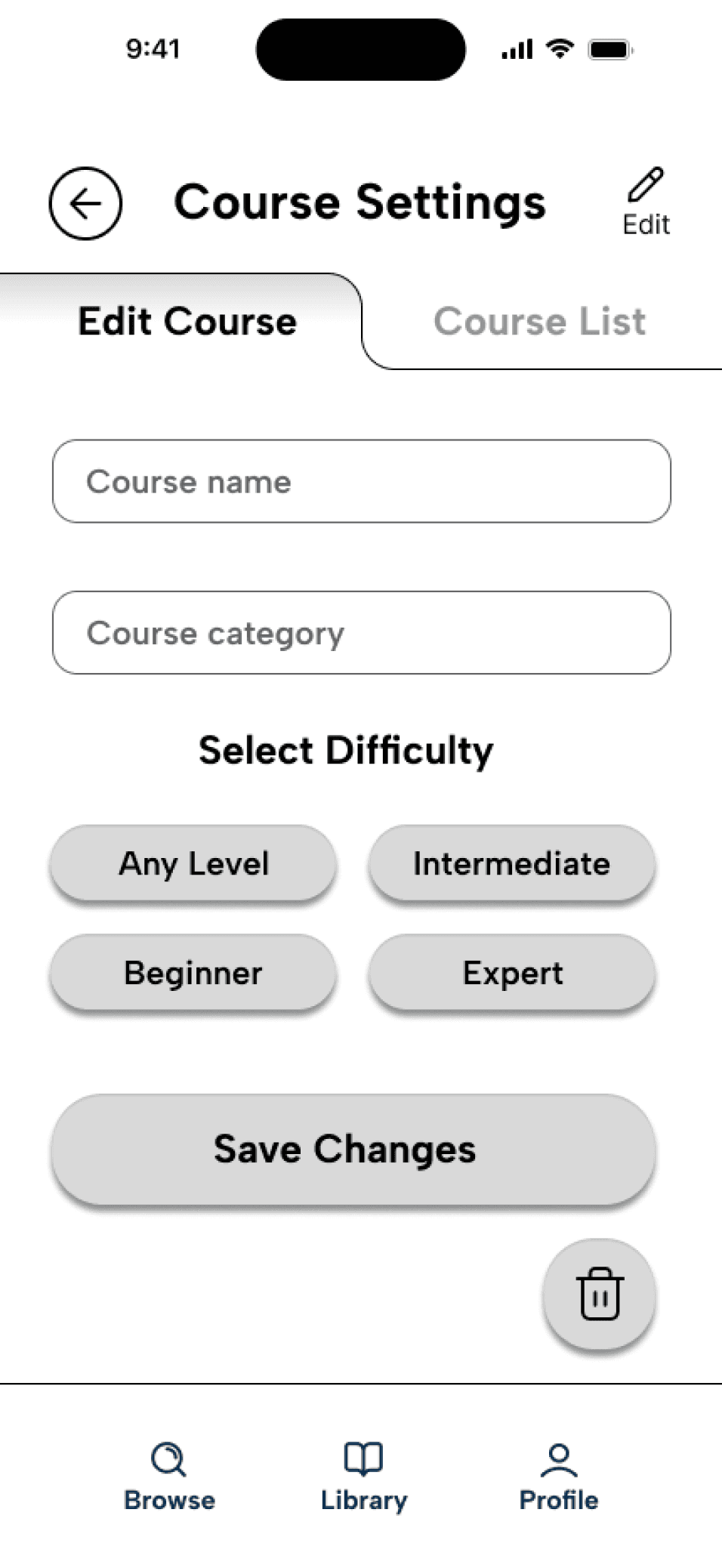
Edit Course
Page
Course List
Page

ITERATION INTO HIGH FIDELITY
User Testing:
The goal of our Usability Testing was to identify if a user can successfully navigate through various flows as a mentor on our app.
We conducted tests with four people in our mentor age group, and each test had four tasks:
Task 1:
Can the user successfully complete the mentor onboarding process?
Task 2:
Can the user successfully navigate to the Tools tab and understand how to learn about all of the resources available to them?
Task 3:
Can a mentor-type user complete all of the necessary steps to publish a new course?
Task 4:
Can a mentor-type user complete all of the necessary steps to publish a new class?
Testing Results:
Redundancy between onboarding screens and Tools > Getting Started info
Prototyping issues, especially with input form fields and keyboards
Confusion on purpose and clarity of placeholder text and elements
Edit button not needed on Create Course and Create Class pages
Testing Results:
Based on the results we found in our user testing, we began making iterations to the original wireframes.
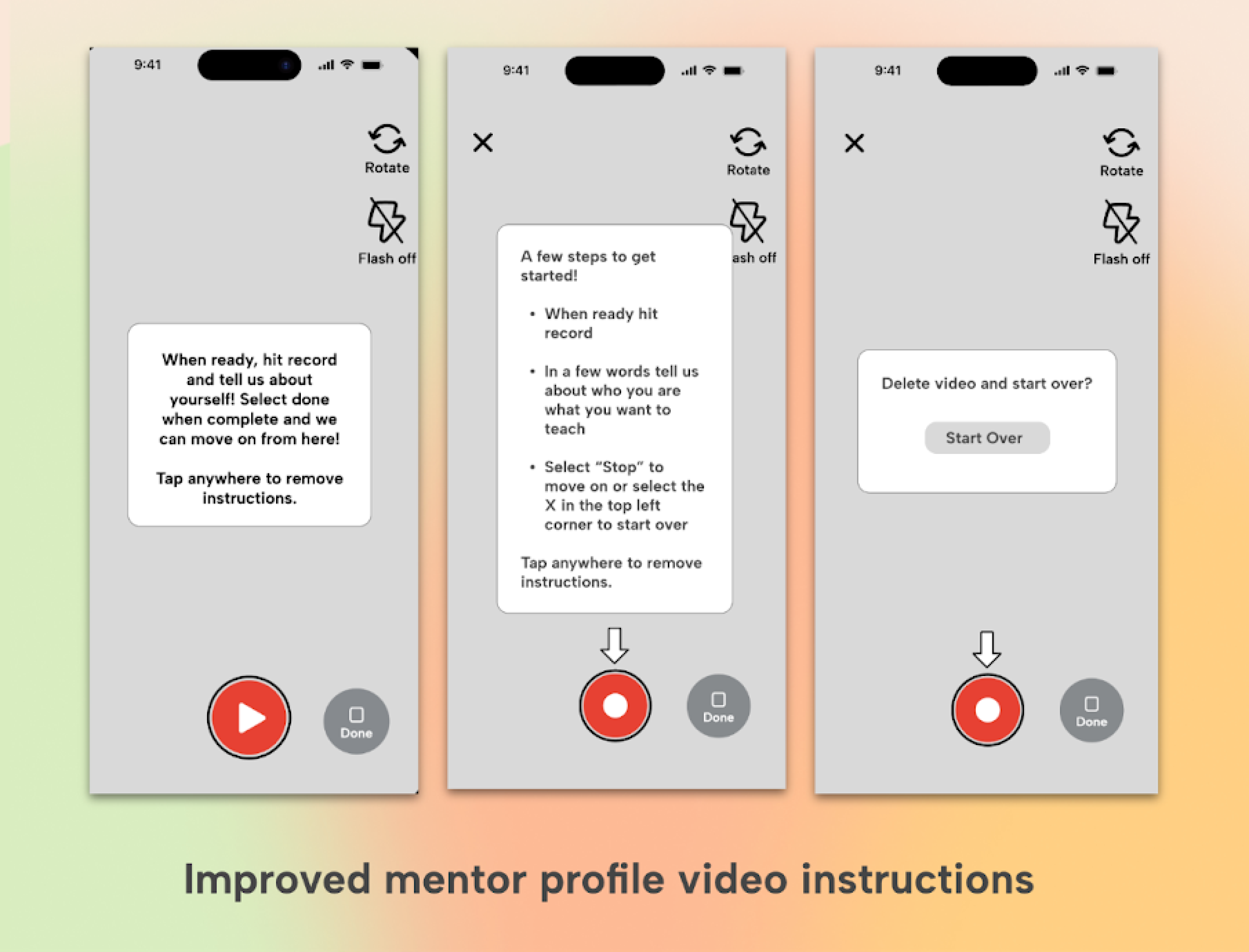
The first iteration we made was a change to the camera interface. We found that changing the icon on the camera more clearly communicated that this is a record function and not a playback. We also added the option to delete and start over if users were unhappy with their original video.
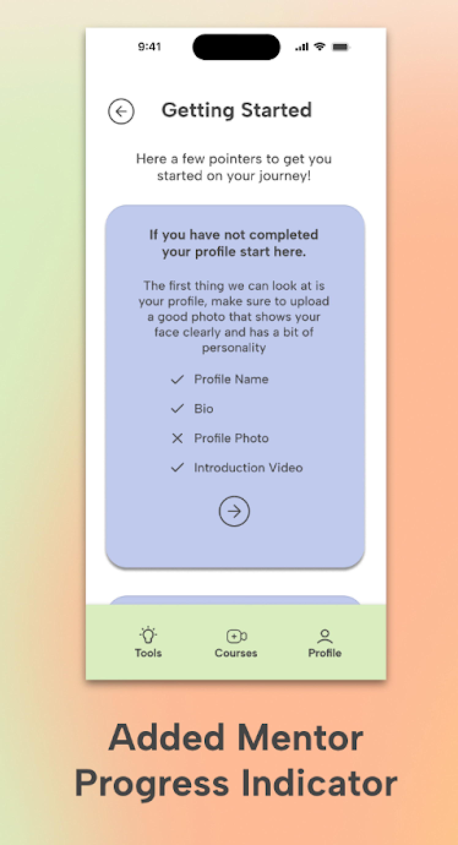
The next observation we made was that users were making it to the getting started tab in mentor resources but the app was not communicating how much they had already completed. Our testers were being asked if some items needed to be completed or if there was a place they could find. To remedy this issue, we added a checklist that would show users what items have been completed and which have not. This had the added benefit of encouraging users to not only complete the sign up portion of onboarding, but to complete their profile bio, add a profile picture, and even upload a welcome video.
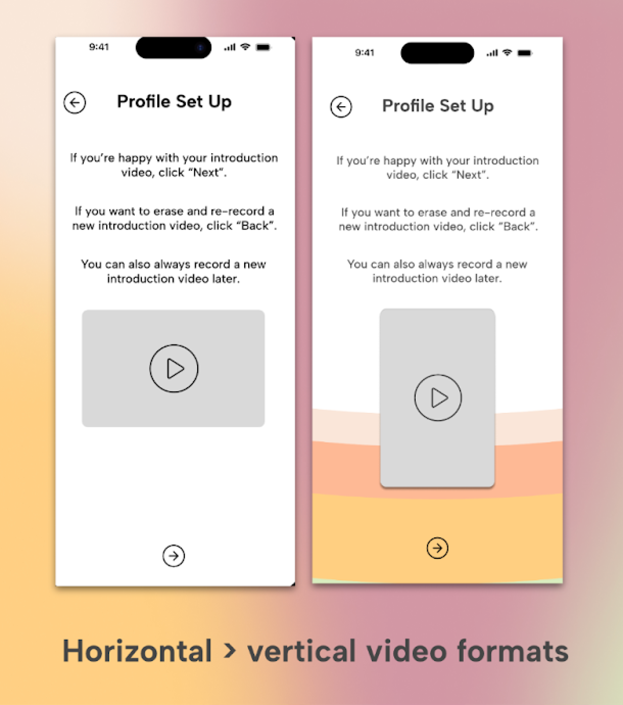
During user testing, we also noticed confusion regarding the orientation of video presented on the app. We found that user intuitively recorded their welcome videos vertically but when shown a horizontal thumbnail on the following screen asked our testers whether or not they needed to go back and start over, recording in landscape. On following iterations of the prototype, video thumbnails defaulted to a vertical format unless user selected landscape while recording.
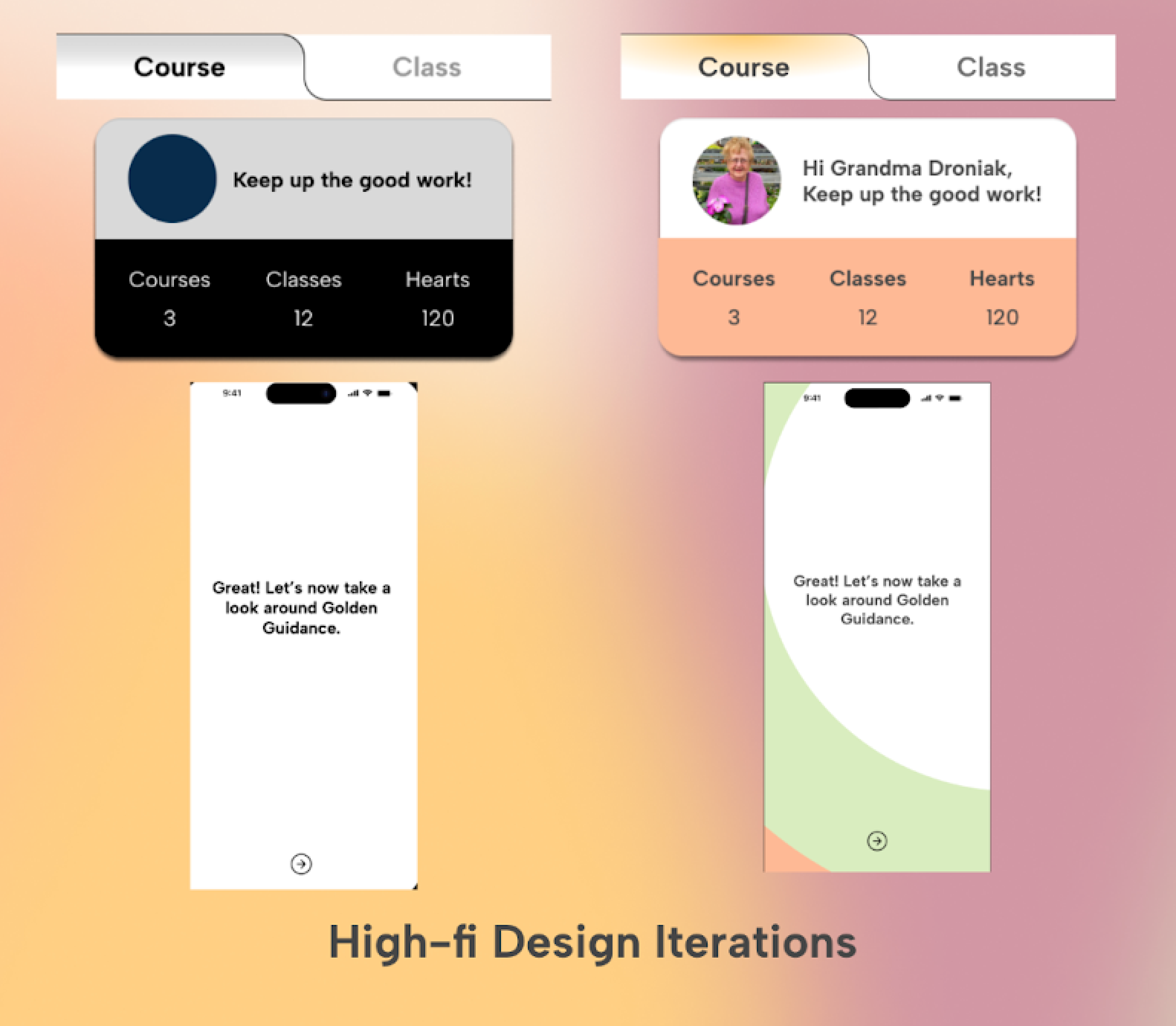
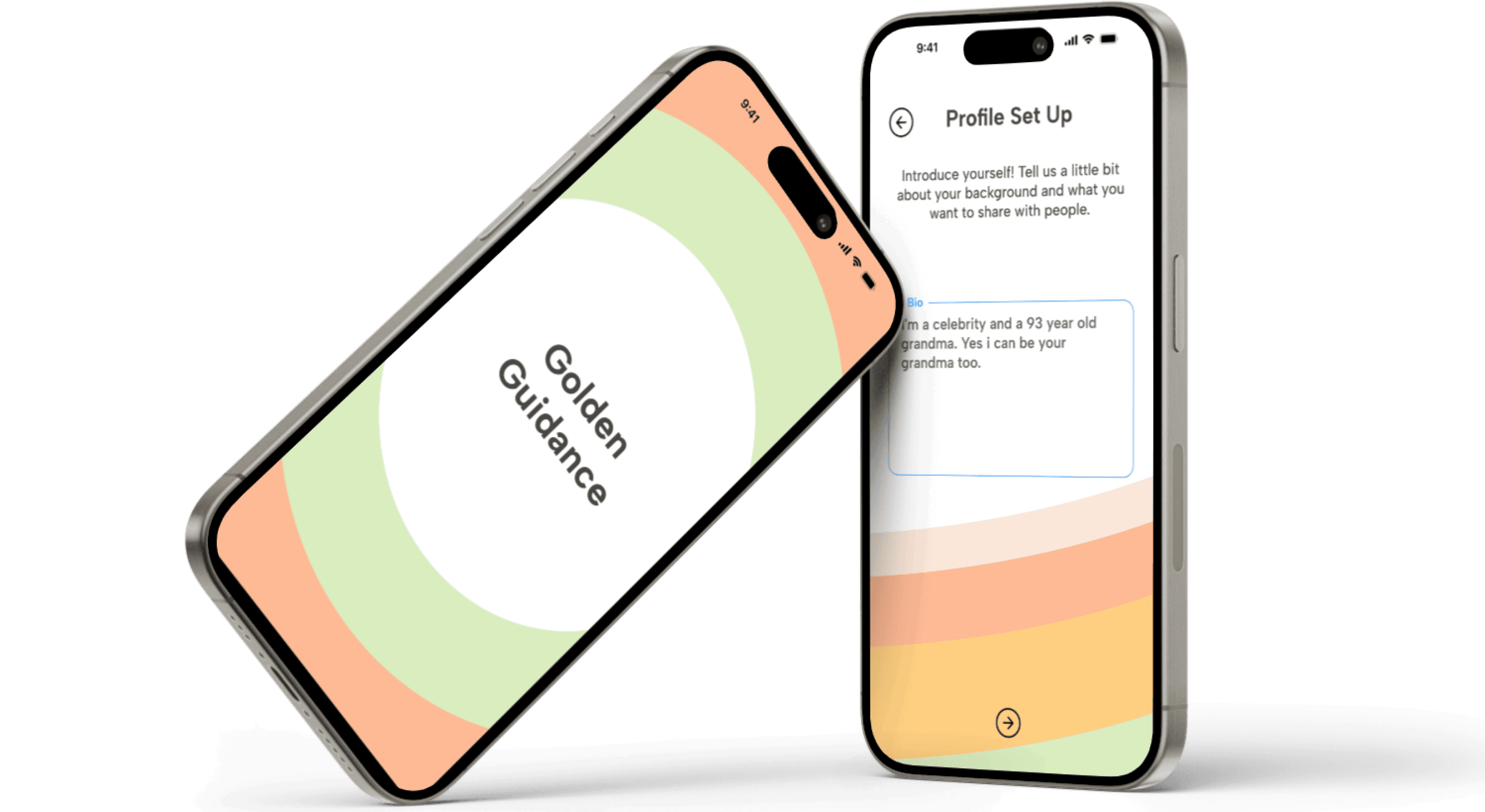
At this point, revisions had been made to our prototype that ackowledged the issues we encountered during user testing. We took the wireframes from the improved prototype and began stylizing the UI. We added transition animations, skeuomorphic effects to certain elements, and used color to add even more clarity to the apps navigation.
We also worked on several color schemes that fit our keywords for our app:
COZY
ENGAGING
HYGGE
JOYFUL LEARNING
INTERGENERATIONAL
We created a few different gradients using different color combinations to our home screen to try and get a better feeling for how they would interact and change the general mood
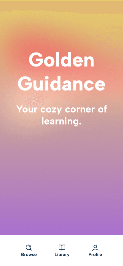
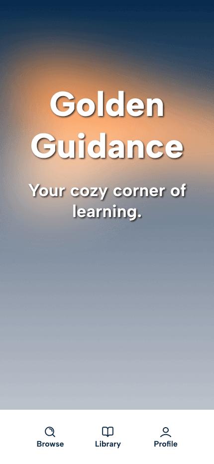
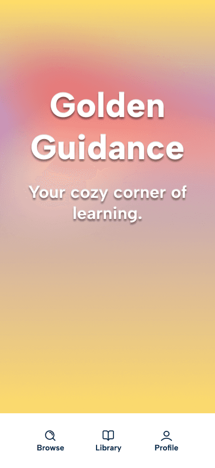
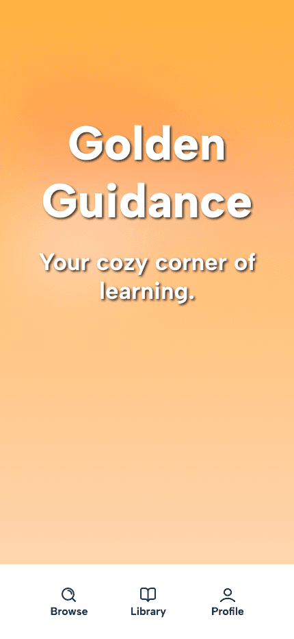
After deciding on a palette of colors we felt best represented the mood we were trying to create we tested the accessibility of the palette. All colors we used were confirmed to have an AA rating from when tested using WCAG standards against the text color we planned to use throughout the app.
#D9EDBF
#FEB995
#FFCF81
#FDFFAB
#C0CBED
#454545
FINAL THOUGHTS & NEXT STEPS
There are several features we would like to build out and iterate on for Golden Guidance. Some of the features that we would like to add include:
MONETIZED
CONTENT:
Mentor side: features allowing mentors to set up paid classes/courses and to connect Zelle, Venmo, or Bank accounts to receive payments.
Learner side: features allowing learners to connect payment method; to filter content by paid and free
IMPROVED HELP FEATURES
FOR MENTORS:
Our original plan to improve mentors’ ability to use the app was to prototype a help chat bot. While we did not build out this feature for this version of the app, our solution was to incorporate the Tools tab in the navigation bar. In the future, we’d like to build out this feature and conduct A/B testing
LEARNER-SIDE
USABILITY TESTING:
We focused the most energy on getting feedback for and iterating on mentor-side flows for our final high-fi prototype. We will create and carry out a Usability Test plan for our learner-side flows and continue to iterate on our high-fi features and designs.